Luxury without clutter
Warm spacing, cleaner typography, and image-led sections help the business feel higher-end right away.
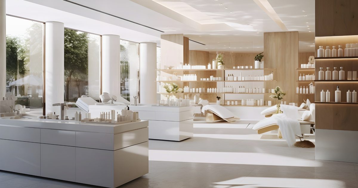
Med spa websites need to feel elevated without becoming cold or confusing. The right structure keeps the experience calm, premium, and focused on booking the next consultation.
Warm spacing, cleaner typography, and image-led sections help the business feel higher-end right away.
Treatment pages, FAQs, and before-and-after positioning help reduce hesitation before the first appointment.
The strongest med spa sites guide visitors toward booking, calling, or requesting a consultation with minimal friction.
These directions keep the visual language cleaner and more polished while still making the consultation path obvious.

These directions keep the visual language cleaner and more polished while still making the consultation path obvious.
Best for med spas and aesthetics brands that need a sharper first impression and a more deliberate booking flow.
Yes. The visual direction can be pushed softer, brighter, warmer, or more editorial depending on the brand.
Yes. Many med spa sites work better when the main call to action is a consultation request rather than a busy booking interface.
Yes. We can create a treatment structure that feels organized without overwhelming the visitor.
Yes. If you send a few examples, we can match the overall direction while tailoring it to the actual business and goals.

